Google Shopping Overview Dashboard
Your whole Google Shopping account on one screen. Eight KPI charts at the top, day-of-week heatmap, brand performance breakdown, impression-share over time, portfolio health summary, revenue-concentration Pareto, and a daily wasted-spend tracker — the view to open first thing every morning.
No signup required to explore the demo.
Your whole Shopping account on one screen
Seven distinct blocks — KPI charts, weekday heatmap, brand performance, impression share, portfolio summary, revenue concentration, wasted-spend tracker — all recalculating with the date-range picker.
-
✓
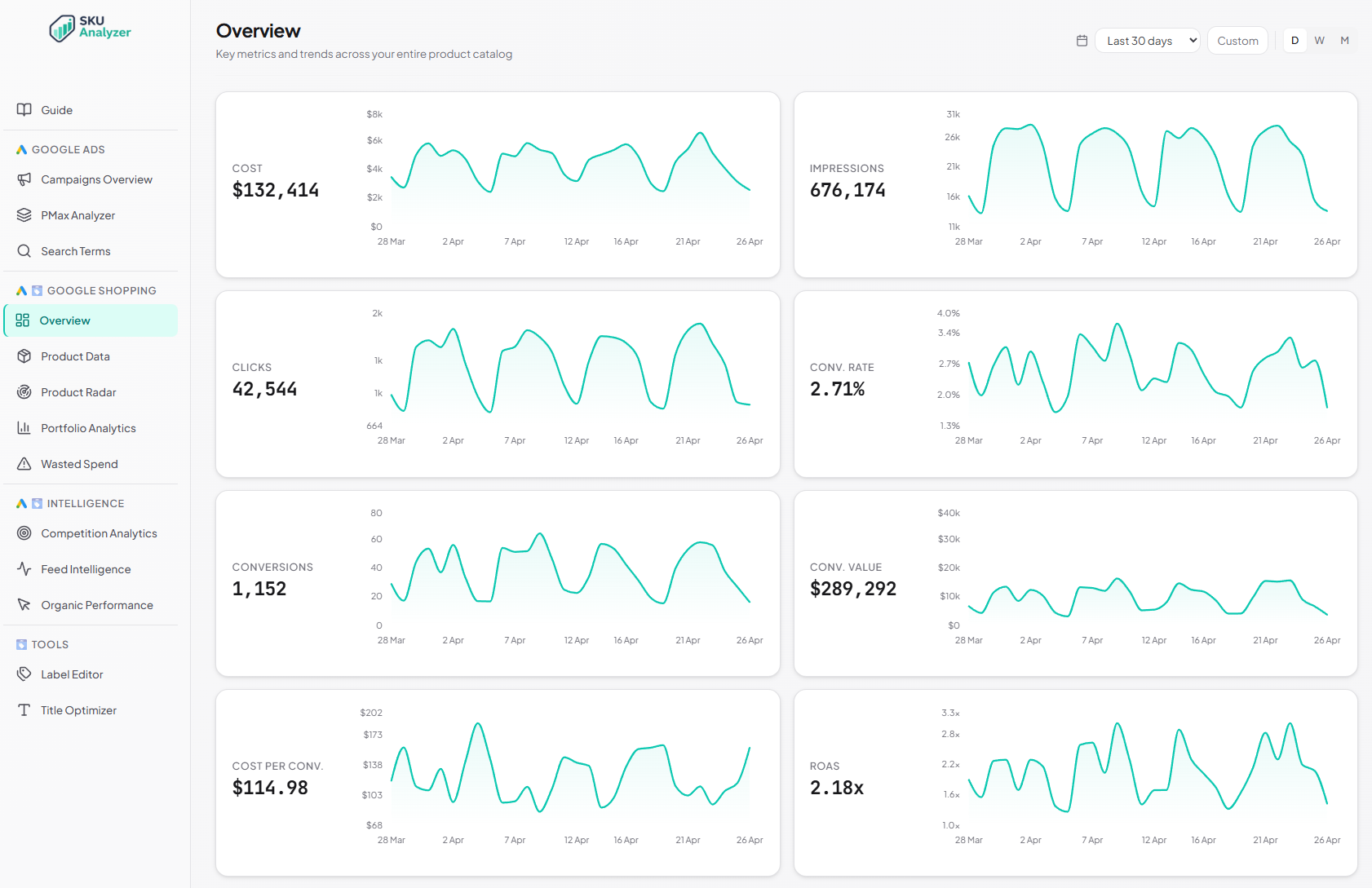
8 KPI charts at the top — Cost, Impressions, Clicks, Conv. Rate, Conversions, Conv. Value, Cost per Conv., and ROAS. Each shows the total plus a daily area chart over the selected period.
-
✓
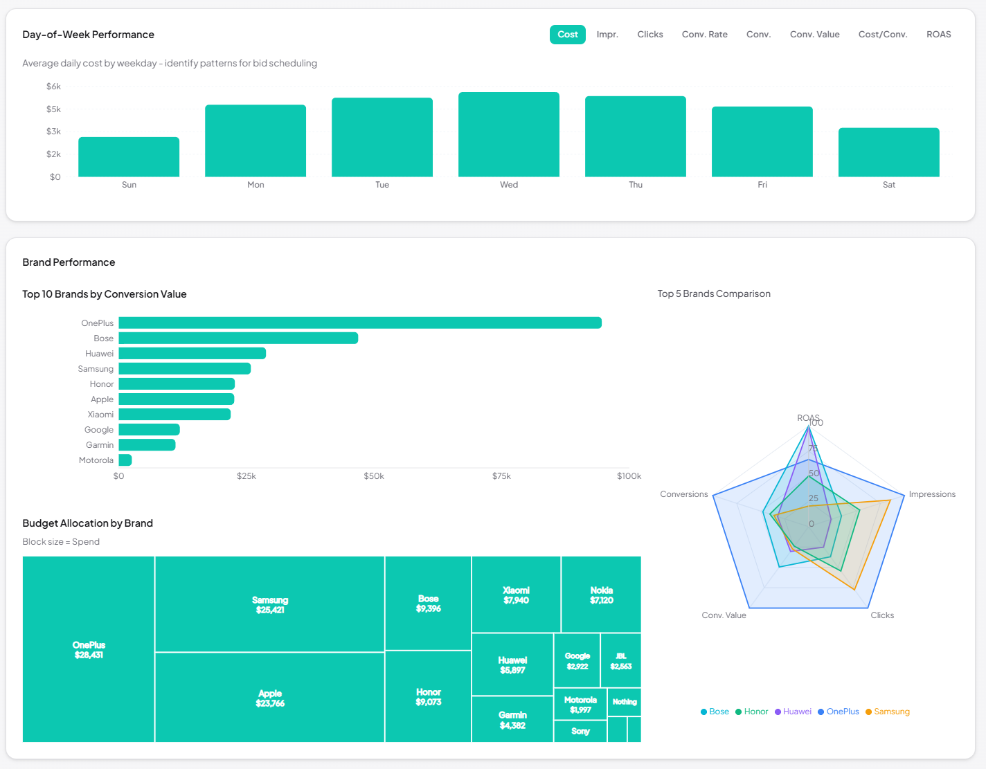
Day-of-week performance heatmap with a metric toggle (cost, revenue, conversions, clicks, impressions). Weekday patterns hidden in time-series jump out here.
-
✓
Brand performance breakdown — top 10 brands ranked by conversion value as a bar chart, a treemap of budget allocation by brand (block size = spend), and a brand impression-share radar.
-
✓
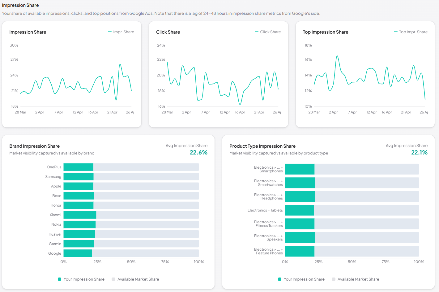
Impression Share over time — Impr. Share, Click Share, and Top Impr. Share plotted day-by-day, plus impression share broken out by brand and by product type.
-
✓
Portfolio summary — total products, available, with spend, on sale; a performance pie classifying SKUs as High Performers, Mid Performers, Burners or Zero Sales; and a top-10 revenue carousel.
-
✓
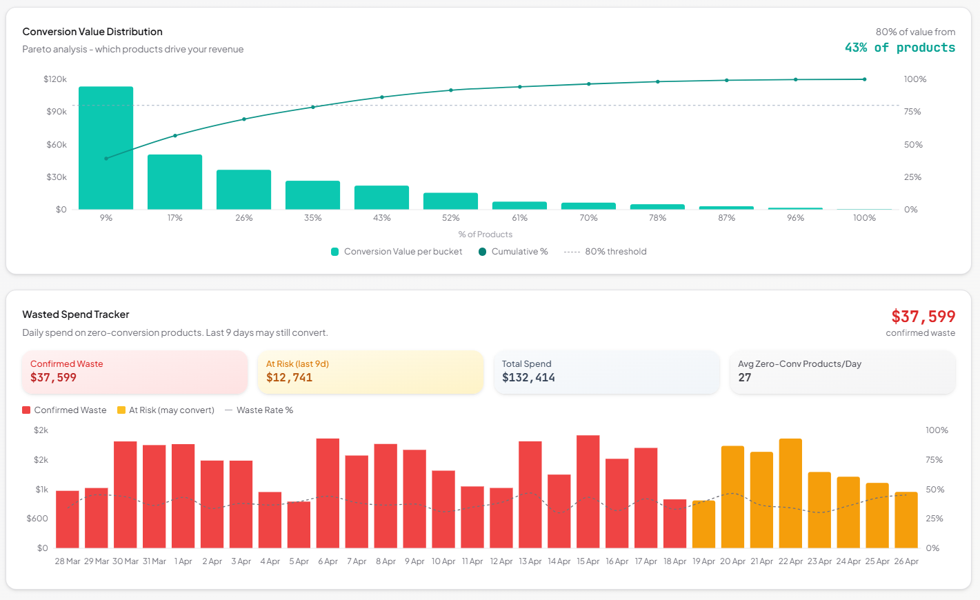
Revenue-concentration Pareto chart — see how many products generate 80% of your conversion value. Spot catalog concentration risk at a glance.
-
✓
Daily wasted-spend tracker — stacked area chart that separates confirmed waste from at-risk spend, conversion-lag aware so you don't cut winners too early.