Performance Max Channel Breakdown — See Inside the PMax Black Box
Break down your Performance Max spend by channel: Shopping, Search, Display, YouTube, and Discover. See where Google is actually spending your money, track channel trends over time, and compare asset group performance.
No signup required to explore the demo
Performance Max Channel Breakdown
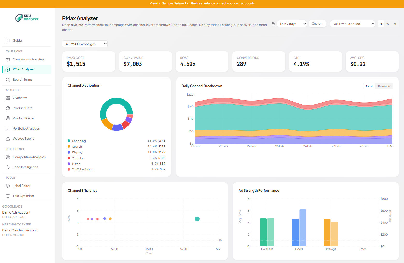
Google controls how your Performance Max budget gets split across Shopping, Search, Display, YouTube, and Discover. You don't get a say, and the Google Ads UI barely shows you the result. The channel breakdown fixes that. A donut chart shows where your money went, and a stacked area chart shows how the split changed day by day.
The donut tells you the story at a glance. If Shopping takes 85% of your Performance Max spend, that's usually healthy for ecommerce. If Display or YouTube are eating 30%+ and your ROAS is dropping, you've found the problem. The stacked area chart adds the time dimension. You can see exactly when Google started shifting budget away from Shopping, and correlate that with your performance changes.
Toggle between cost and revenue views on the daily chart. This lets you compare where Google spends your budget vs. where the revenue actually comes from. If Shopping gets 60% of spend but drives 90% of revenue, that's a signal worth acting on.
- Donut chart: spend distribution across Shopping, Search, Display, YouTube, Discover
- Stacked area chart showing daily channel allocation over time
- Toggle between cost and revenue to compare allocation vs. return
- Catch budget allocation shifts before they tank your ROAS


PMax Asset Breakdown
Every asset group across all your Performance Max campaigns shows up in one sortable table. Each row has the asset group name, its parent campaign, ad strength rating, and full performance metrics: cost, clicks, impressions, CTR, CPC, conversions, revenue, CPA, and ROAS. Sort by any column to find your best and worst performers instantly.
Ad strength badges (Excellent, Good, Average, Poor) are color-coded right in the table, so you can quickly scan which asset groups Google rates highly and whether that rating actually correlates with performance. An asset group rated "Excellent" that has a 0.5x ROAS is a problem worth investigating.
Below the asset groups, a PMax campaigns table shows each campaign with its per-channel spend split. You can see at a glance how much of each campaign's budget goes to Shopping vs. Search vs. Display vs. Video. Click any campaign row to filter the entire page down to that single campaign.
- 11-column asset group table: cost through ROAS, fully sortable
- Color-coded ad strength badges per asset group
- Campaign table with per-channel spend percentages
- Click any campaign to filter the entire page
PMax Channel Comparison
Four comparison charts let you evaluate Performance Max channels side by side. The Channel Efficiency scatter plot maps each channel by cost vs. ROAS, with bubble size representing conversions. Channels above the break-even line are profitable; channels below it are burning budget. You can spot underperformers in seconds.
The Network ROAS bar chart ranks channels by return on ad spend, so you can see which networks deliver the best returns. The Ad Strength Performance chart groups asset groups by Google's ad strength rating and shows average ROAS per tier, alongside total cost. This answers the question everyone has: does Google's ad strength score actually predict performance?
The Conversion Funnel by Channel breaks down each network's impressions, clicks, and conversions as horizontal bars. This shows you the full funnel efficiency per channel. A channel with millions of impressions but barely any conversions is likely wasting your budget on low-intent placements.
- Channel Efficiency scatter: cost vs. ROAS with break-even reference line
- Network ROAS ranked bar chart across all channels
- Ad Strength Performance: does Google's rating predict your ROAS?
- Conversion Funnel: impressions to clicks to conversions per channel

Frequently Asked Questions
How does SKU Analyzer break down Performance Max channels?
Google's API reports Performance Max spend by network type (Shopping, Search, Display, Video, Cross-Network). SKU Analyzer pulls this data daily and maps it to a donut chart, stacked area trend, and channel comparison charts. It's the same data behind Google's Insights tab, structured into a proper dashboard you can actually analyze.
Can I filter the Performance Max page by individual campaign?
Yes. A campaign selector dropdown lets you filter to any single Performance Max campaign. All charts, KPIs, and tables update to show just that campaign's data. By default, the page aggregates across all your PMax campaigns, which is useful when you run multiple campaigns for different product categories.
What metrics are shown in the asset group table?
Each asset group row shows: name, parent campaign, ad strength badge (Excellent/Good/Average/Poor), cost, clicks, impressions, CTR, CPC, conversions, conversion value, CPA, and ROAS. Every column is sortable, so you can rank asset groups by whatever metric matters most to you.
What is the Channel Efficiency chart?
The Channel Efficiency scatter plot maps each Performance Max network by cost (x-axis) vs. ROAS (y-axis), with bubble size showing conversion volume. A reference line at 1.0x ROAS marks break-even. Channels above the line are profitable, channels below are losing money. It's the fastest way to see which PMax channels are actually working for you.
How far back can I see Performance Max channel data?
SKU Analyzer syncs the last 14 days automatically every night and supports manual backfills up to 750 days. Your channel breakdown, asset group performance, and campaign comparisons go back as far as your synced data. Date range presets (7, 14, 30, 90 days) and custom ranges make it easy to compare different time periods.
Open the PMax black box
Explore the PMax channel breakdown with sample data, or apply for early access to connect your own account.