Product Radar — Visual Scatter Plot for Google Shopping
Your top 100 products plotted on an interactive scatter chart. Product images as data points, 7 configurable axes, and rich hover tooltips. Spot outliers and identify clusters of high performers across your catalog.
No signup required to explore the demo
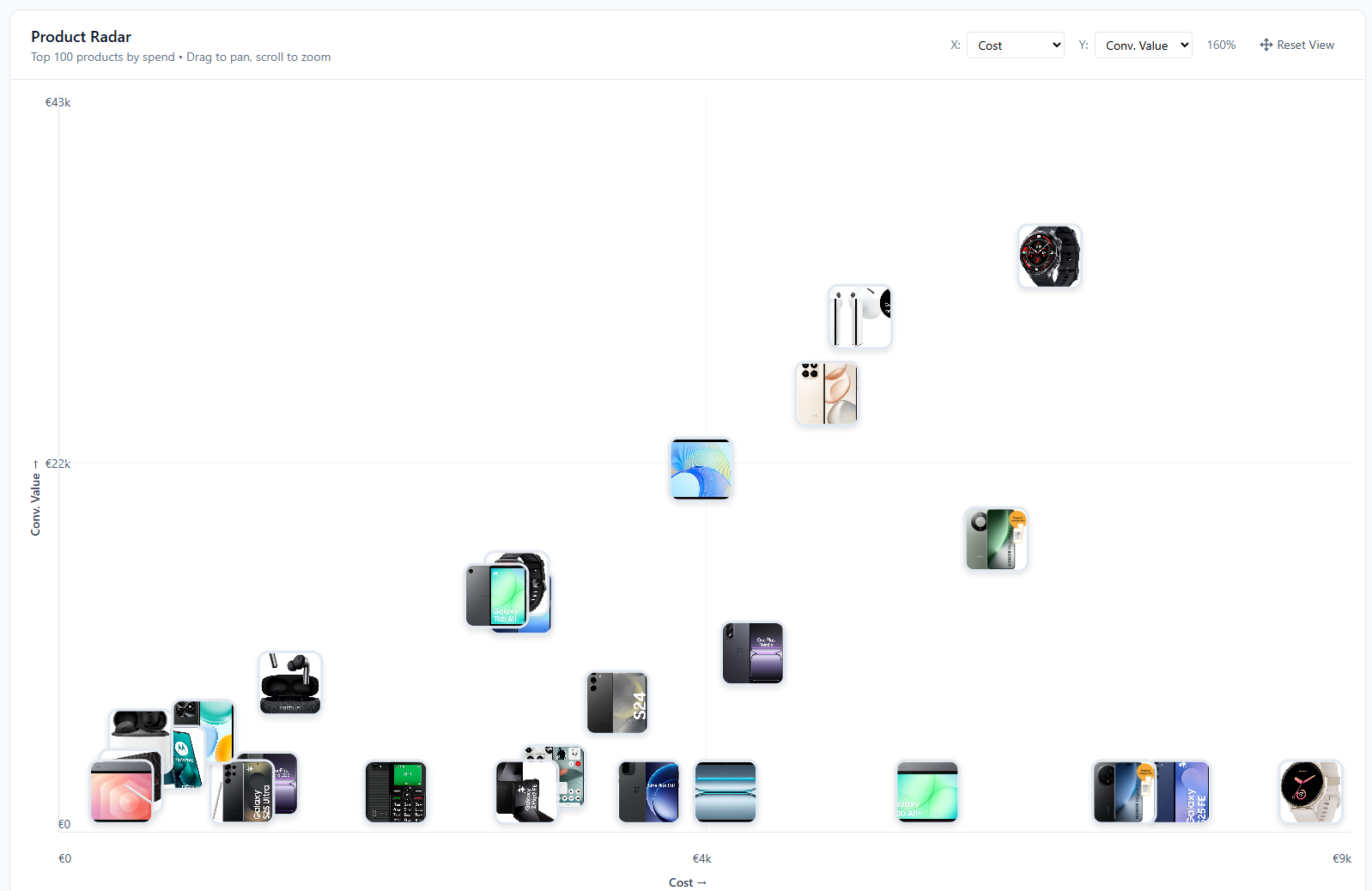
Interactive Scatter Plot with Product Images
The Product Radar plots your top 100 products by spend on a two-axis scatter chart. Each data point is the actual product image, so you can identify products visually without hovering or clicking. The chart is fully interactive. Zoom, pan, and click any product to see its details.
Standard tables and bar charts force you to read row by row. A scatter plot lets you see your entire catalog's performance distribution in one view. Outliers, clusters, and gaps become obvious. A product with high spend but low ROAS stands out visually in a way a sorted table never will.
Select the date range, and the chart loads your top 100 products ranked by spend. Change the X and Y axes to explore different metric combinations.
- Product images as interactive data points
- Top 100 products by spend displayed at once
- Zoom, pan, and click for product details
- Instant visual pattern recognition
Rich Hover Tooltips with Instant Metrics
Hover over any product image on the scatter plot and a tooltip pops up with the product title, image thumbnail, and a 2-column grid of performance metrics: cost, revenue, ROAS, conversions, clicks, and CPA. You get the full picture without clicking anything or leaving the chart view.
This is where the scatter plot stops being abstract and starts being actionable. You spot a product sitting in an odd position on the chart, hover over it, and immediately see why. Maybe it spent heavily but generated zero conversions. Maybe it has a great ROAS but barely any clicks. The tooltip gives you the numbers that explain the visual position.
Tooltips update as you change the axis metrics and date range. The data always matches what the chart is showing, so you can switch between Cost vs. Revenue and CPA vs. Conversions views and keep hovering to triage products without interruption.
- Product image, title, and 6 key metrics on hover
- Cost, revenue, ROAS, conversions, clicks, and CPA in a clean grid
- Triage outliers without clicking or navigating away


Click to Open the Full Product Card
Click any product on the scatter plot and a detail sidebar slides open on the right. It shows the product title, ID, brand, and availability status at the top, followed by a full 8-metric performance grid: spend, revenue, ROAS, clicks, impressions, conversions, CPA, and CTR. Below that you get pricing details and all five custom label fields.
The sidebar gives you everything you need to evaluate a product without leaving the radar view. Spotted a high-spend outlier? Click it and check the ROAS, CPA, and conversion count right there. If the product has a custom label like "bestseller" or "clearance", you'll see that too. A direct link to the product page lets you open the actual listing when you need more context.
The selected product gets highlighted on the chart with a teal border so you don't lose track of where it sits relative to the rest of your catalog. Click another product to switch, or close the sidebar to go back to exploring.
- 8 performance metrics: spend, revenue, ROAS, clicks, impressions, conversions, CPA, CTR
- Brand, availability status, price, and sale price
- All 5 custom label fields (L0 through L4) as badges
- Direct link to open the product listing page
Frequently Asked Questions
How many products does Product Radar show?
Product Radar displays your top 100 products ranked by spend for the selected date range. The focus stays on the products that matter most to your budget while keeping the chart readable and interactive.
Can I change what metrics are on each axis?
Yes. Both X and Y axes support 7 metrics: Cost, Conversion Value, ROAS, CPA, Clicks, Impressions, and Conversions. Switch axes instantly to explore 21 different metric combinations.
What data is shown when I hover over a product?
The tooltip shows the product title, a larger product image, and all key performance metrics for the selected date range including cost, revenue, ROAS, CPA, clicks, impressions, and conversions.
Visualize your product catalog
Explore the Product Radar with sample data, or apply for early access to connect your own account.